So you invest quite a bit of time, money, and resources into driving targeted traffic to your website. But what types of things are you doing to encourage conversion once a visitor arrives? Creating effective calls to action requires more than throwing up a phone number and a "contact us" menu selection. Here are 5 tips for creating effective 'calls to action' on your website:
Communicate The Benefits - Visitors to your site care about how you can help them solve their legal issues. When constructing your calls to action you have to think about what you are offering and how it helps the visitor solve a problem. Most importantly, you need to clearly explain the benefits of your offer prior to asking your visitor to do something. Take for example the MailChimp email marketing service homepage:
They describe what the service does and how it can help you:
MailChimp helps you design email newsletters, share them on social networks, integrate with services you already use, and track your results. It's like your own personal publishing platform.
This is followed by call to action asking the user to sign up for free.
If you are offering a "free consultation", concisely describe the benefits of the consultation and what a user can expect to get accomplished during the meeting. It is much stronger to provide context and a compelling reason for the consult than simply offering one for free with no other basis.
Be Clear & Specific - If you want people to take an action on your website you have to be very clear and specific about what you want them to do and how they should do it. Simply having a phone number in the upper right corner and a contact us page doesn't tell me what you want me to do. Not that having these things on your site a bad idea (I would recommend it in fact), it's just that this isn't a strong call to action for a visitor.
Do you want them to call you directly? Do you want them to download a guide or e-book? Do you want them to fill out a more detailed evaluation online first? Think about what you want to happen and then construct a call to action that lays out the exact steps for the visitor to take. The more guidance you give users the better the user experience will be for them and the higher your conversion.
Make Sure The Visitor Knows What Happens Next - Have you ever started a process online (ie: registration, download, signup, etc) only to stop because you aren't quite sure what is going to happen next? This is very unsettling and the end result is usually abandonment by the user. Do I have to go through a long and cumbersome sign up process? Am I buying something immediately when I click this? What happens with my personal info I’m filling in? Making sure your call to action and the subsequent process clearly explains to the user what is coming next, what you are doing with the information, and set expectations accordingly.
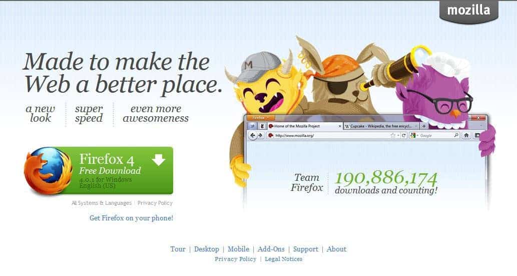
Size & Color - You want your call to action to stand out. Two effective methods for getting your call to action noticed is size and color. Making your call to action big and a contrasting color from the areas around it draws people's attention. Check out this call to action on the download page for the Firefox web browser:

The call to action makes it pretty apparent what you should do next.
Placement - There are a couple of points that are important regarding placement of the call to action.


Here's a recent Google SERP for "𝘄𝗵𝗼 𝗮𝗿𝗲 𝘁𝗵𝗲 𝗯𝗲𝘀𝘁 𝗰𝗮𝗿 𝗮𝗰𝗰𝗶𝗱𝗲𝗻𝘁 𝗹𝗮𝘄𝘆𝗲𝗿𝘀 𝗶𝗻 𝗽𝗵𝗶𝗹𝗮𝗱𝗲𝗹𝗽𝗵𝗶𝗮." Ads? ❌LSAs? ❌Local Pack? ❌Links? ❌ 🔷 AI Overview? ✅ 6 firms listed. Only one tiny 🔗. Click the 𝗦𝗵𝗼𝘄 𝗺𝗼𝗿𝗲 button? 𝗬𝗼𝘂 𝗴𝗲𝘁: Here's a more detailed look at some of these firms: THE PEARCE LAW FIRM, P.C.Edith Pearce, […]
On April 22, 2025, Google sent an email updating Local Services Ads Additional Terms for Providers: Subject: Action required: important updates to Local Service Ads Additional Terms Many people are arguing that lawyers cannot participate in Local Services Ads, as this would constitute a per se violation of the Rules of Professional Conduct related to […]
Conrad and I recently joined Zack at Lawyerist to record a conversation about AI and marketing. You might think that we spend the whole time on how lawyers can use AI to publish content. You'd be wrong. While AI can certainly support publishing, there are many more interesting ways to use it in legal marketing. […]
As more legal services consumers turn to ChatGPT for local law firm recommendations, a fascinating intersection between AI, search, and maps unfolds. While Google remains the undisputed leader in local business data, ChatGPT is increasingly becoming an entry point for searchers seeking legal representation. But here’s the kicker: instead of keeping users within its ecosystem, […]
When law firms contact us, they usually want to talk: • PPC Ads • SEO Rankings • Lead Generation Very few want to talk: • Brand • Trust & Recognition • Emotional Connection Admittedly, much of this concerns that AttorneySync is known for lead generation across those common digital channels. But even when we start […]
According to an October 2024 study by SE Ranking: "The legal niche triggers the highest percentage of AIOs (77.67%). The average number of links matched between the AI Overview resources and the top 20 search results was 6.49 for legal topics. AI Overviews for legal topics most frequently link to NYCourts.gov (114 links), YouTube.com (48 […]
I'm grateful for my friend, Charley Mann of Law firm Alchemy. If you're a lawyer, subscribe to his Free Email List. In a recent email, Charley calls out bad guru advice on hiring: "Trying to execute a major SEO improvement? You need to find people who will help you, instead of trying to DIY it […]
If you’ve spent any time on LinkedIn, you’ve likely seen posts from law firm SEO experts showing off charts with an “up and to the right” trajectory. These screenshots, often pulled from tools like Semrush or Ahrefs, are meant to signal SEO success. And it’s not just the agencies celebrating—𝗹𝗮𝘄 𝗳𝗶𝗿𝗺𝘀 𝘁𝗵𝗮𝘁 𝗵𝗮𝘃𝗲 𝗵𝗶𝗿𝗲𝗱 𝘁𝗵𝗲𝗺 […]
Meh, links! All things being equal, links still tend to move the dial more than any other factor in legal SERPs. Maybe links are having a diminishing impact internet-wide. But in my experience, quality links, especially relevant links (both topically and geographically), tend to improve law firm visibility in search more than most everything else. […]