
Have you "smartphone-optimized" your law firm sites with a responsive design? Read on to learn about responsive design and whether it's the right move for your firm.
If you're wondering about the future of how people access the web, simply look around. Do you see all those people with their faces buried in their smartphones and tablets? We're at the beginning of a major shift in how people access the internet.
The chart at the top of this post was pulled from a Google Analytics account of a firm we work with. It's showing the trend of mobile visitor traffic to the firm's site. As you can see, many more people are using mobile devices to visit this firm's site.
As we've previously discussed:
When mobile devices first began to appear, the problem was that they couldn’t display the “regular internet” (or the desktop/browser internet). During this transition period, web developers came up with a variety of different workarounds for displaying websites on mobile devices. While these different techniques offered temporary solutions to mobile user experience problems, they also created several new problems. Some these issues impacted how sites might perform in search results.
Here's an excerpt from the Wikipedia entry for responsive design:
Responsive web design (RWD) is a web design approach aimed at crafting sites to provide an optimal viewing experience—easy reading and navigation with a minimum of resizing, panning, and scrolling—across a wide range of devices (from desktop computer monitors to mobile phones).
If you're still trying to wrap your head around what exactly responsive design is, there's perhaps no better demonstration than John Polacek's presentation, What The Heck Is Responsive Web Design? TNW also provides some inspiring responsive design examples.
If you're looking for more in-depth responsive web design reading, be sure to check out Ethan Marcotte's Responsive Web Design. I own it. It's good.
While responsive designs might not be the best option for every site, it's been our experience that the majority of legal sites we come across would benefit from a responsive design. This is especially true for blogs. Fortunately, many of the popular free blogging platforms (i.e. WordPress, Blogger) have made their default theme responsive.
Unfortunately, since the mainstream adoption of responsive design is fairly new, chances are that your site isn't responsive.
If you're looking for an excuse to get to Vegas and are interested in responsive web design, Robert Algeri will be speaking on the subject at the LMA conference in Las Vegas on April 9th.
Finally, if you'd like to talk about making your site responsive, feel free to schedule a free consultation with us.
[button link="/evaluation/?ref=blog_btn" size="xl" style="tick" color="teal"]Free Responsive Web Design Consultation[/button]
One of the first steps in deciding whether a responsive design is the right move for you, is taking a look at your website and blog on mobile devices. You'll want to start by looking at which combinations of mobile device types, browsers, operating systems, resolutions, etc. are driving the most traffic now.
Ideally, you can view your site through the actual devices. Obviously, you might not have access to a variety of smartphones, tablets and other mobile devices on which to test your site. There are several free mobile device emulators online. Still, don't completely rely on these as some of them don't produce accurate renderings for all the various device, OS, resolution combinations.
For quick mobile device spot-checking, I like the Window Resizer Chrome extension which allows you to save and manage a variety of resolutions:
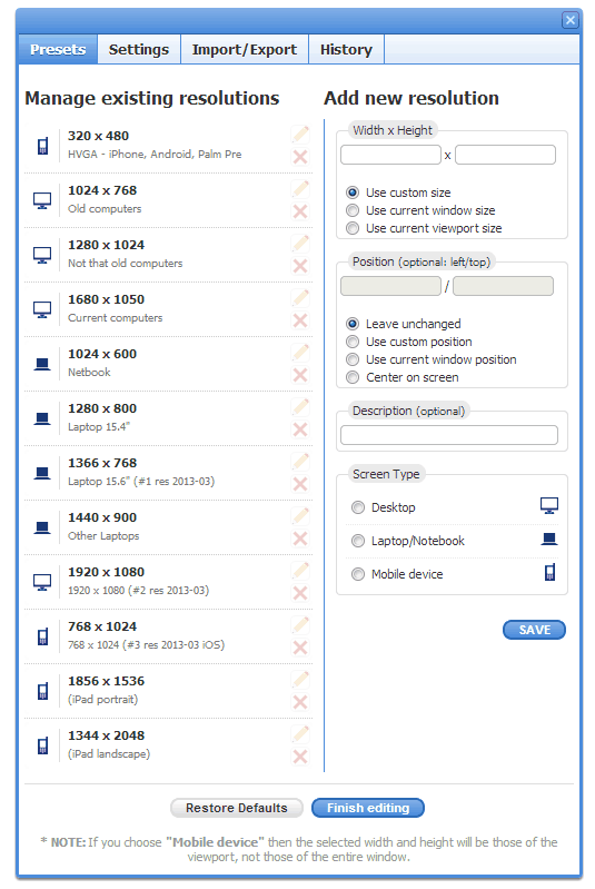
Again, it doesn't always render your site exactly as it might appear on mobile devices, but it's helpful for a quick check and reference.
Over at SEOmoz, Distilled's Kristina Kledzik has a nice post on potential SEO implications related to responsive design. Her's one highlight:
With a responsive web design, a link to your main site is a link to your mobile site as well. Mobile sites are still new, so your competition in mobile search is going to have significantly fewer backlinks. A responsively-designed website will have the backlinks of your original site, even while competing for mobile visitors. It’ll give you an instant edge over there. And, as mobile usage rises and webmasters start linking to mobile sites, your backlinks from both mobile and desktop sites will combine for a stronger backlink profile.
Remember, mobile isn’t just a device, it's also a behavior.
We've seen some big wins from switching clients to responsive themes. If the people you want to attract are using mobile devices to access your web properties, it's just common sense to optimize your sites and blogs for mobile.

Here's a recent Google SERP for "𝘄𝗵𝗼 𝗮𝗿𝗲 𝘁𝗵𝗲 𝗯𝗲𝘀𝘁 𝗰𝗮𝗿 𝗮𝗰𝗰𝗶𝗱𝗲𝗻𝘁 𝗹𝗮𝘄𝘆𝗲𝗿𝘀 𝗶𝗻 𝗽𝗵𝗶𝗹𝗮𝗱𝗲𝗹𝗽𝗵𝗶𝗮." Ads? ❌LSAs? ❌Local Pack? ❌Links? ❌ 🔷 AI Overview? ✅ 6 firms listed. Only one tiny 🔗. Click the 𝗦𝗵𝗼𝘄 𝗺𝗼𝗿𝗲 button? 𝗬𝗼𝘂 𝗴𝗲𝘁: Here's a more detailed look at some of these firms: THE PEARCE LAW FIRM, P.C.Edith Pearce, […]
On April 22, 2025, Google sent an email updating Local Services Ads Additional Terms for Providers: Subject: Action required: important updates to Local Service Ads Additional Terms Many people are arguing that lawyers cannot participate in Local Services Ads, as this would constitute a per se violation of the Rules of Professional Conduct related to […]
Conrad and I recently joined Zack at Lawyerist to record a conversation about AI and marketing. You might think that we spend the whole time on how lawyers can use AI to publish content. You'd be wrong. While AI can certainly support publishing, there are many more interesting ways to use it in legal marketing. […]
As more legal services consumers turn to ChatGPT for local law firm recommendations, a fascinating intersection between AI, search, and maps unfolds. While Google remains the undisputed leader in local business data, ChatGPT is increasingly becoming an entry point for searchers seeking legal representation. But here’s the kicker: instead of keeping users within its ecosystem, […]
When law firms contact us, they usually want to talk: • PPC Ads • SEO Rankings • Lead Generation Very few want to talk: • Brand • Trust & Recognition • Emotional Connection Admittedly, much of this concerns that AttorneySync is known for lead generation across those common digital channels. But even when we start […]
According to an October 2024 study by SE Ranking: "The legal niche triggers the highest percentage of AIOs (77.67%). The average number of links matched between the AI Overview resources and the top 20 search results was 6.49 for legal topics. AI Overviews for legal topics most frequently link to NYCourts.gov (114 links), YouTube.com (48 […]
I'm grateful for my friend, Charley Mann of Law firm Alchemy. If you're a lawyer, subscribe to his Free Email List. In a recent email, Charley calls out bad guru advice on hiring: "Trying to execute a major SEO improvement? You need to find people who will help you, instead of trying to DIY it […]
If you’ve spent any time on LinkedIn, you’ve likely seen posts from law firm SEO experts showing off charts with an “up and to the right” trajectory. These screenshots, often pulled from tools like Semrush or Ahrefs, are meant to signal SEO success. And it’s not just the agencies celebrating—𝗹𝗮𝘄 𝗳𝗶𝗿𝗺𝘀 𝘁𝗵𝗮𝘁 𝗵𝗮𝘃𝗲 𝗵𝗶𝗿𝗲𝗱 𝘁𝗵𝗲𝗺 […]
Meh, links! All things being equal, links still tend to move the dial more than any other factor in legal SERPs. Maybe links are having a diminishing impact internet-wide. But in my experience, quality links, especially relevant links (both topically and geographically), tend to improve law firm visibility in search more than most everything else. […]
